Heritage Junction Brand identity case study
Software: Adobe Illustrator, Adobe Photoshop, & Indesign
Collaborative Brand Guidelines Project with Andrea Sagastume & Rebecca Nolasco
In this collaborative group project, my team—Andrea, Rebecca, and I—was tasked with developing a comprehensive visual brand identity for our local museum, Heritage Junction. Our goal was to create a cohesive and recognizable brand identity system that reflects the museum’s rich history while making it more visually engaging for the community.
Our case study focused on:
✔ Brand Identity System – Establishing a clear and consistent visual language.
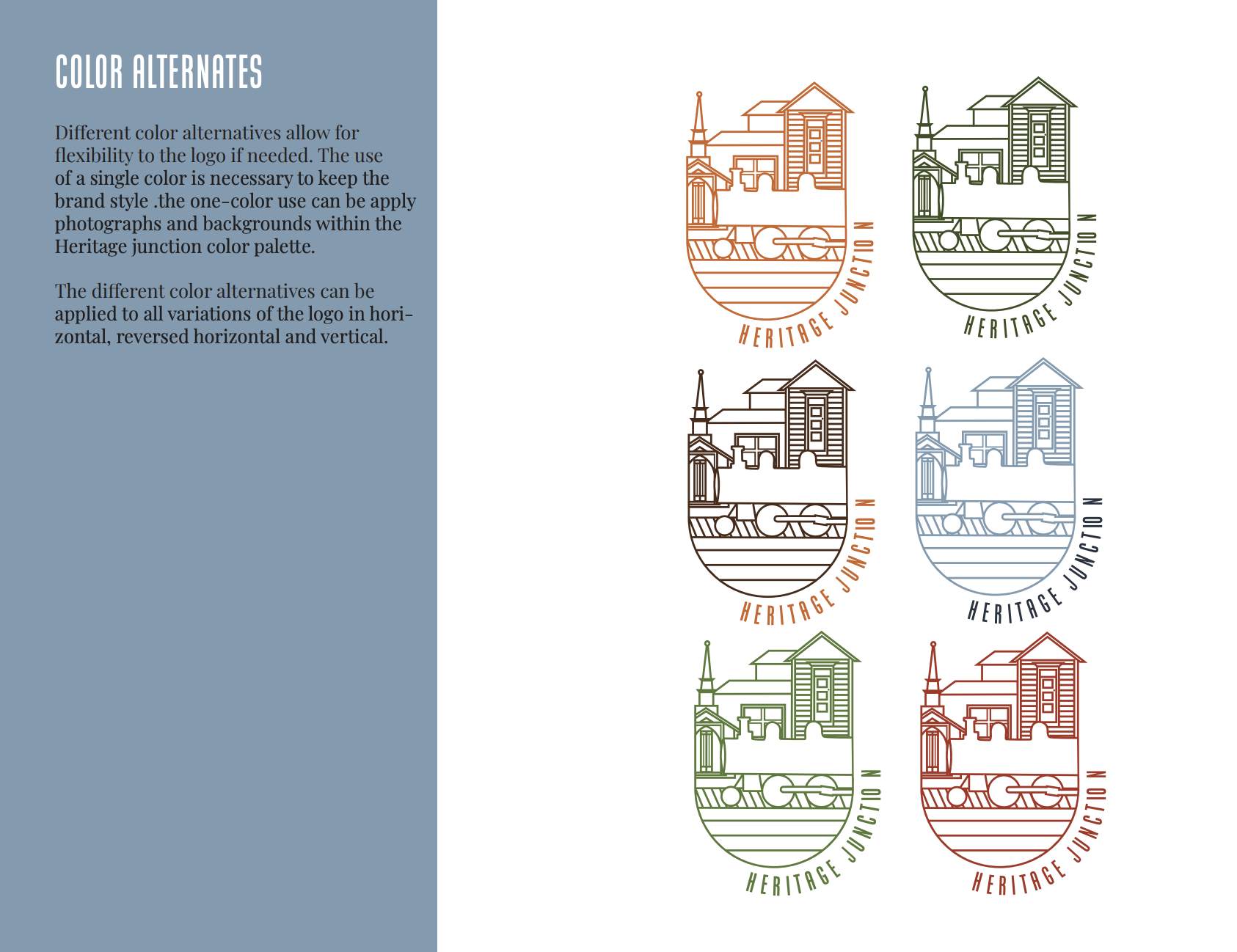
✔ Color Palette – Selecting colors that evoke a sense of history, nostalgia, and warmth.
✔ Illustration Styles – Incorporating visuals that capture the essence of Heritage Junction.
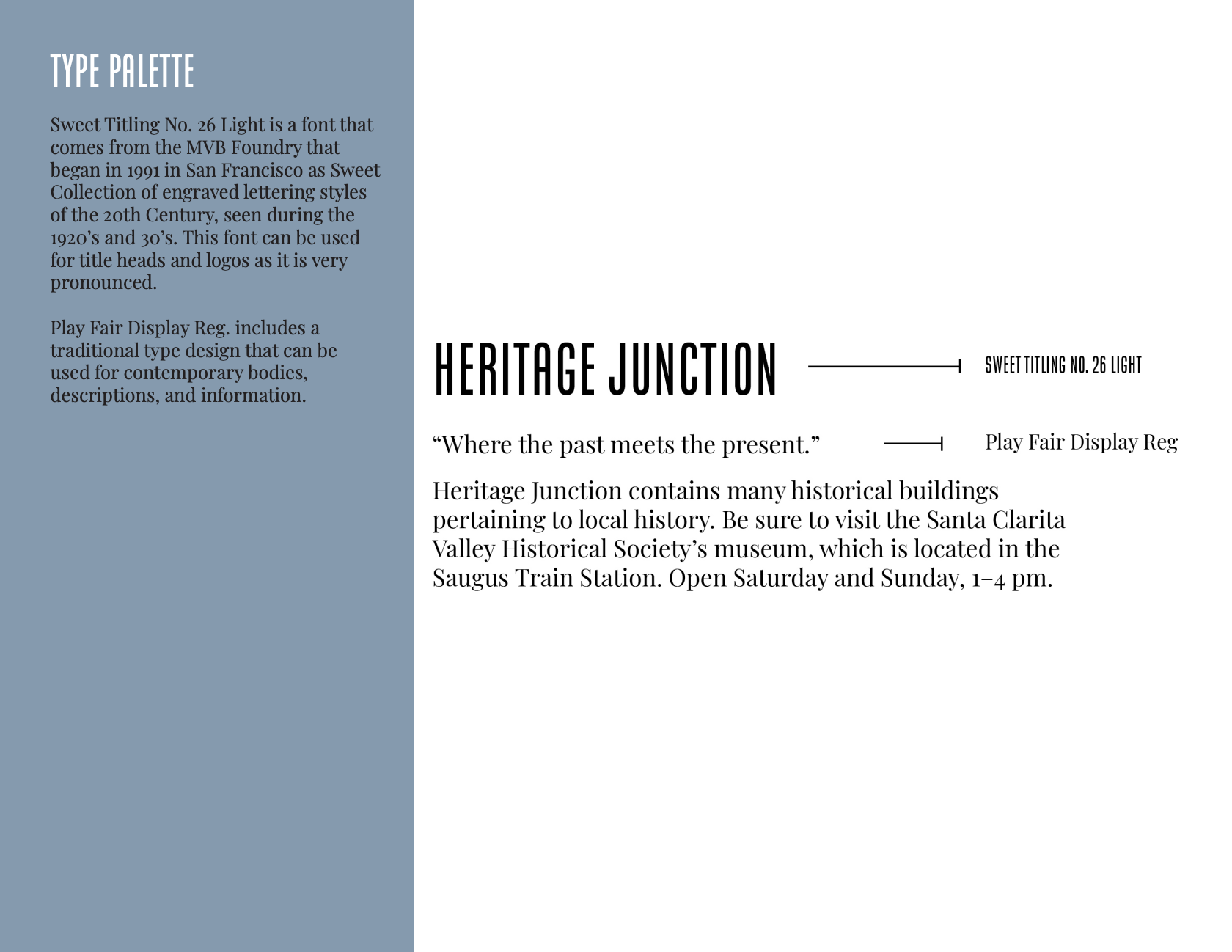
✔ Supportive Typography – Choosing typefaces that balance tradition with modern readability.
This project showcases my ability to collaborate effectively, develop strategic brand guidelines, and apply design principles to real-world organizations. It reflects my skills in typography, layout design, and brand storytelling to create a lasting visual impact.
Moodboard
Before beginning our design sketches, my group and I created a moodboard to establish a strong visual direction for our brand identity. This process included researching the museum’s history, gathering logo design inspirations, and curating type palettes to define the overall aesthetic.
During my research, I focused on making the train the central focal point of the logo, as it is one of the most iconic symbols of Heritage Junction. For the color palette, I selected hues that best reflected the natural surroundings of the museum, ensuring a design that felt both authentic and visually cohesive.
Sketches
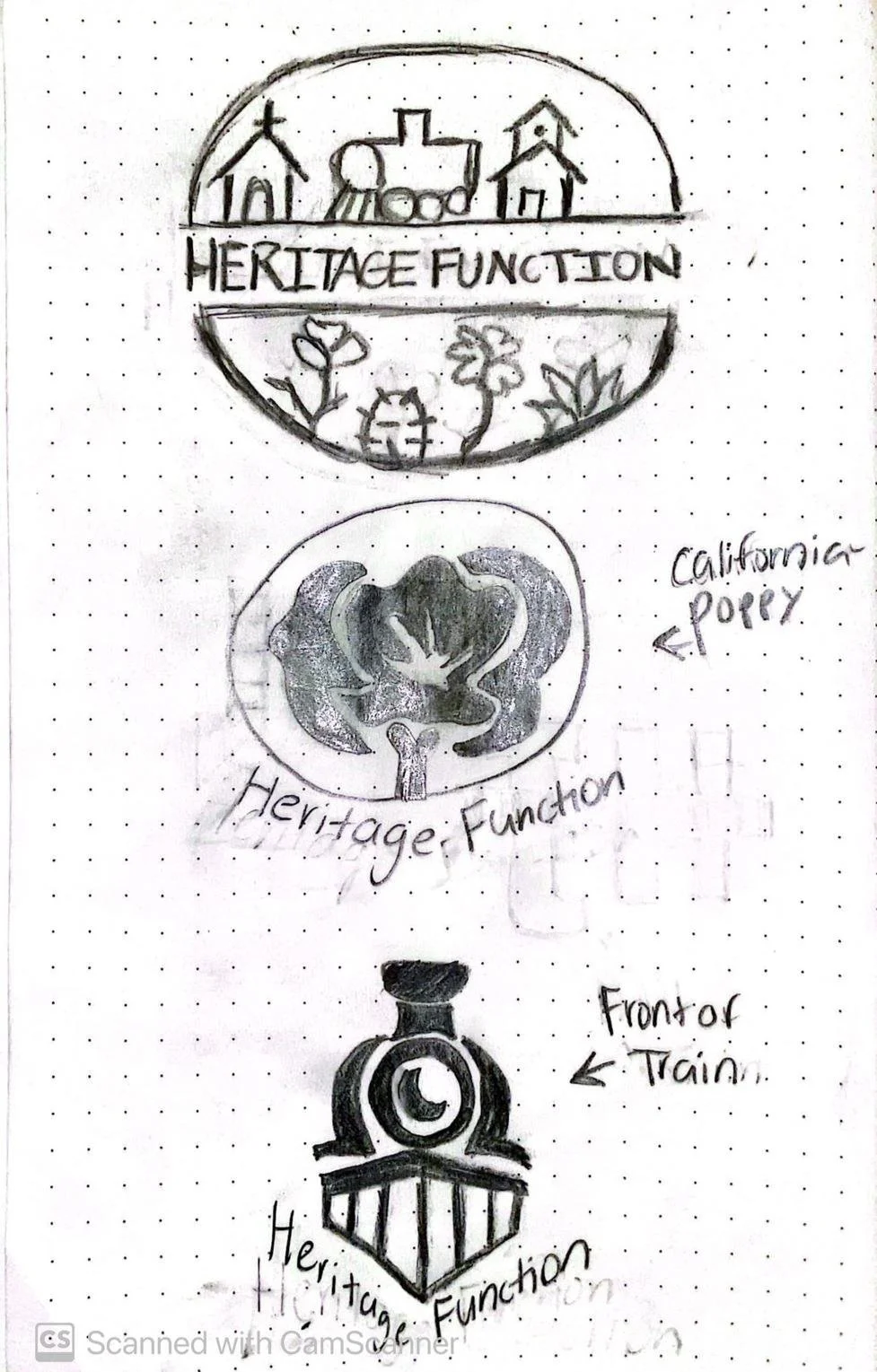
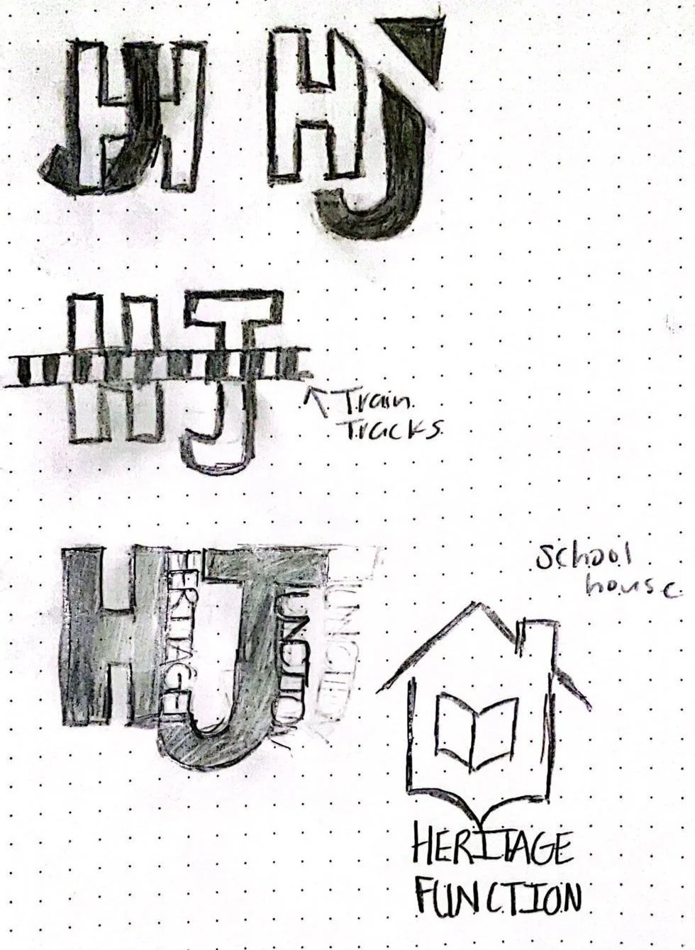
After finalizing our mood board, my group and I began the logo design process by sketching multiple concepts to explore different visual directions. We each contributed ideas and collaborated to select the strongest concept for the final design.
For my sketches, I explored two distinct approaches:
✔ Modern & Typographic: Clean, contemporary designs incorporating the letters H and J to create a sleek, recognizable mark.
✔ Illustrative & Site-Inspired: Logos featuring key elements from the museum, such as the chapel, train, California poppy, schoolhouse, and cactus, capturing the essence of what visitors experience at Heritage Junction.
This phase of the project highlights my concept development skills, ability to balance modern and historical aesthetics, and attention to meaningful design choices that connect to the museum’s identity.
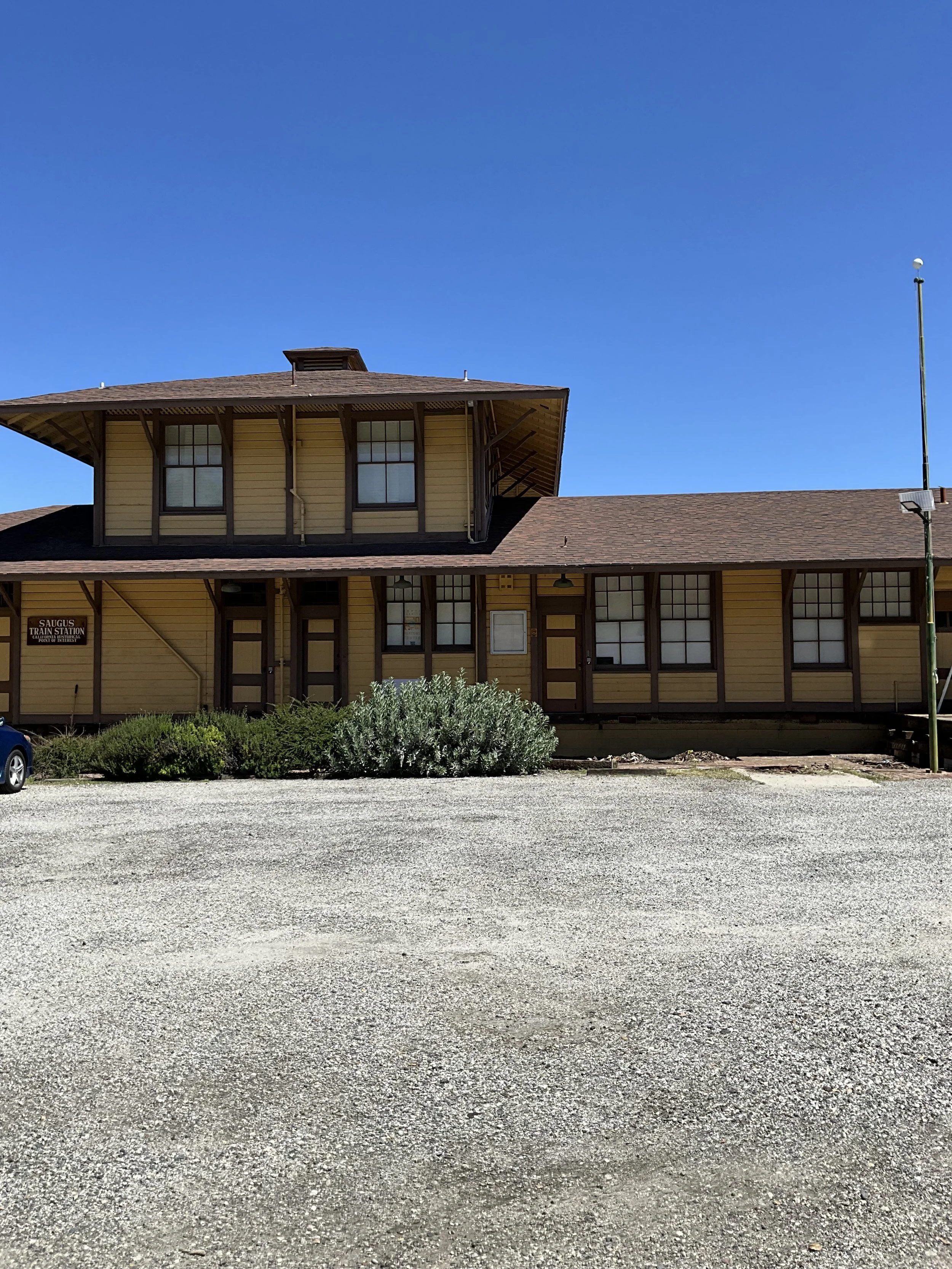
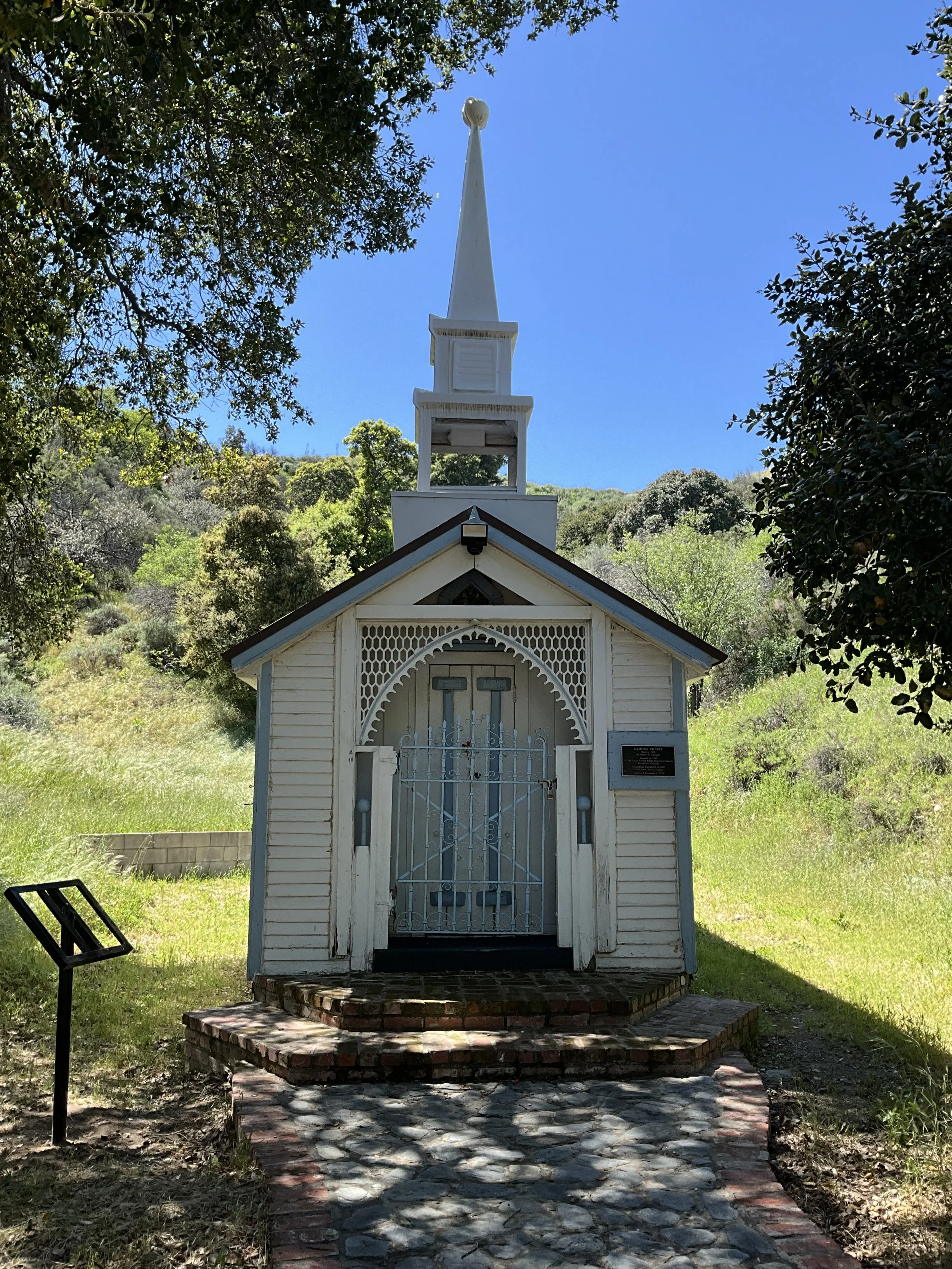
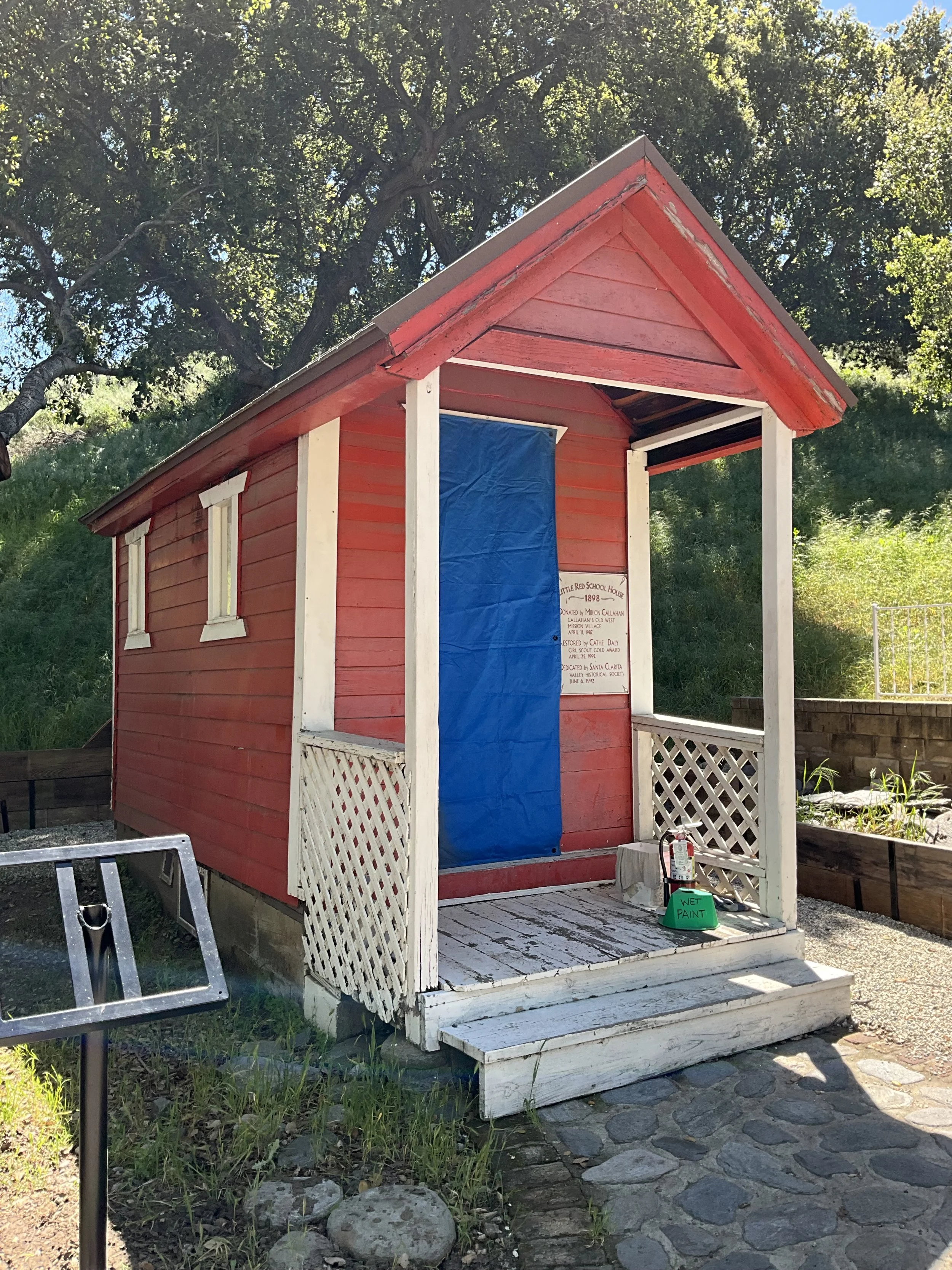
As part of our branding process, we visited Heritage Junction to capture photos of the museum site and gain a deeper understanding of its visual elements. Taking these reference photos allowed us to study the architectural details, historical landmarks, and natural surroundings, which helped inspire potential logo designs. By photographing the buildings, we were able to visualize and sketch their silhouettes more accurately, making it easier to translate their essence into our branding. This hands-on approach played a crucial role in helping our team refine our concepts and ultimately decide on a final design that truly represents Heritage Junction’s historical significance.
Logo Comps
After completing our moodboard and visiting the museum, my group and I moved on to digital logo compositions in Adobe Illustrator. This phase allowed us to explore different design directions before selecting our primary logotype.
For my four logo designs (featured on the far left), I incorporated key elements from the museum’s environment, including the train, cactuses, chapel, and flowers. These symbols were chosen to visually represent the historical and natural essence of Heritage Junction, ensuring a logo that feels both authentic and meaningful.
Primary Logotype
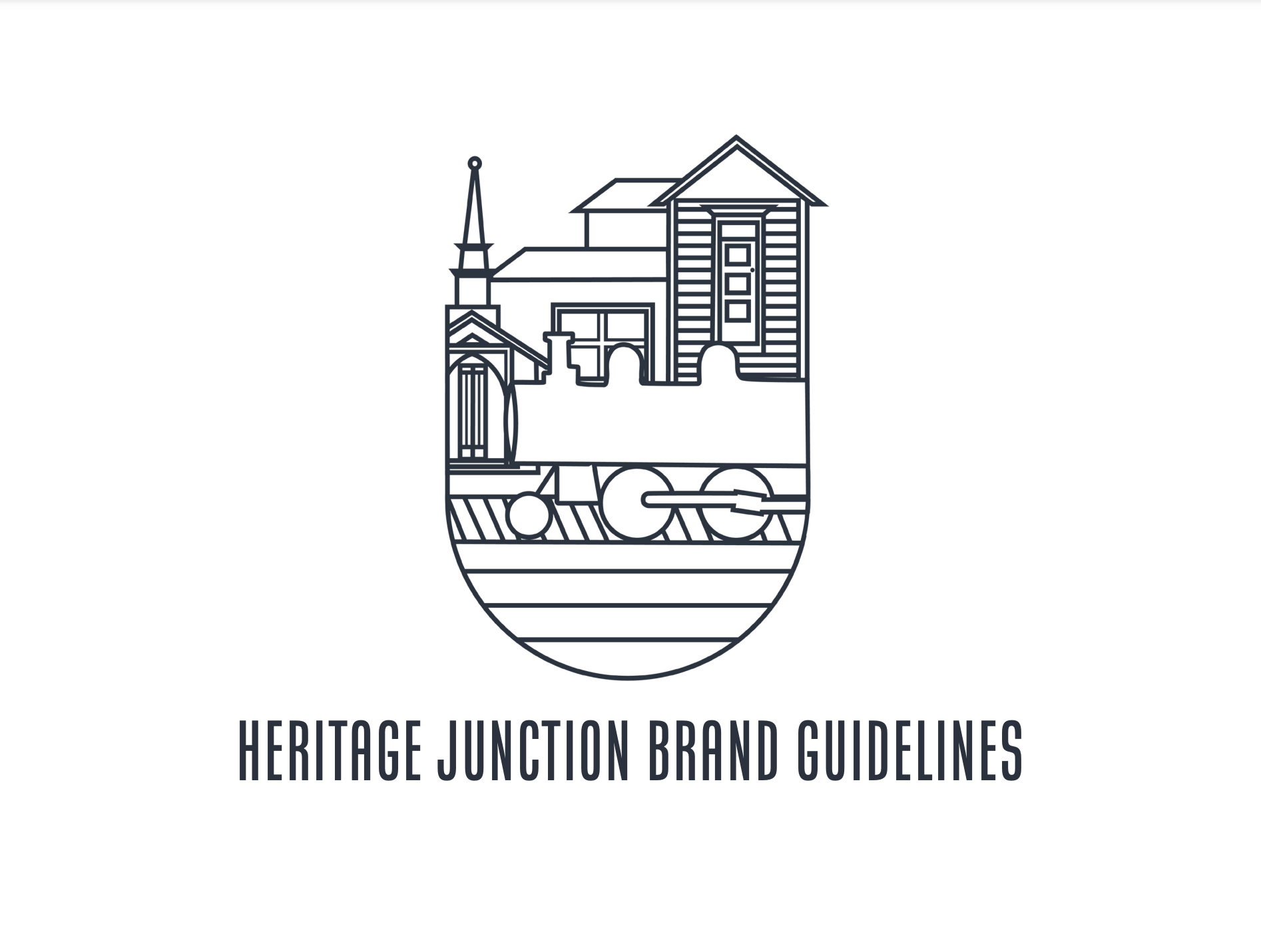
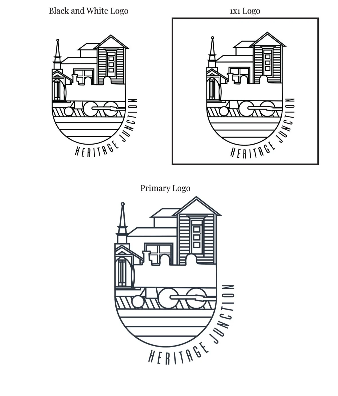
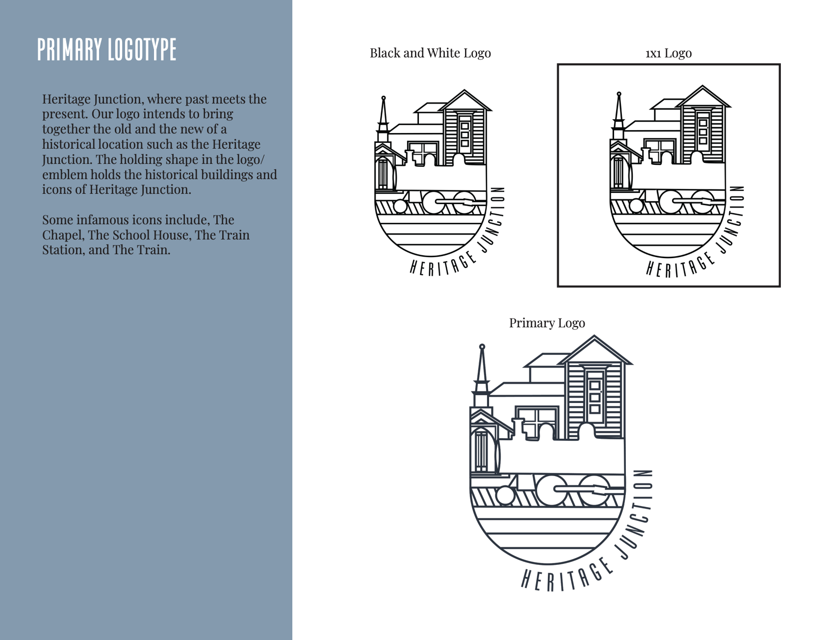
For the final logotype, our group selected a design created by Rebecca, which successfully blends the old and new aspects of Heritage Junction’s historical identity. The emblem-style design serves as a holding shape, encapsulating the museum’s iconic buildings and landmarks to create a visual connection between the past and present.
This selection highlights our team’s ability to collaborate, refine design choices, and develop a logotype that authentically represents the museum’s historical significance while maintaining a modern appeal.
Design Assets
After finalizing our primary logo, Andrea and I collaborated on creating design assets for our mockups. Andrea illustrated the top three icons in our pattern palette, while I illustrated the bottom three: the California Poppy, natural elements, and a hawk—symbols that reflect the museum’s surrounding environment.
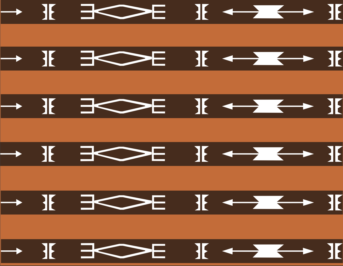
Additionally, I designed a Tataviam-inspired pattern to acknowledge the indigenous history of the Santa Clarita Valley. This pattern serves as a visual reminder that the land once belonged to the Tataviam people and should be honored and respected.
This phase of the project showcases my illustration skills, cultural awareness, and ability to design meaningful assets that enhance a brand’s storytelling.
Mockups
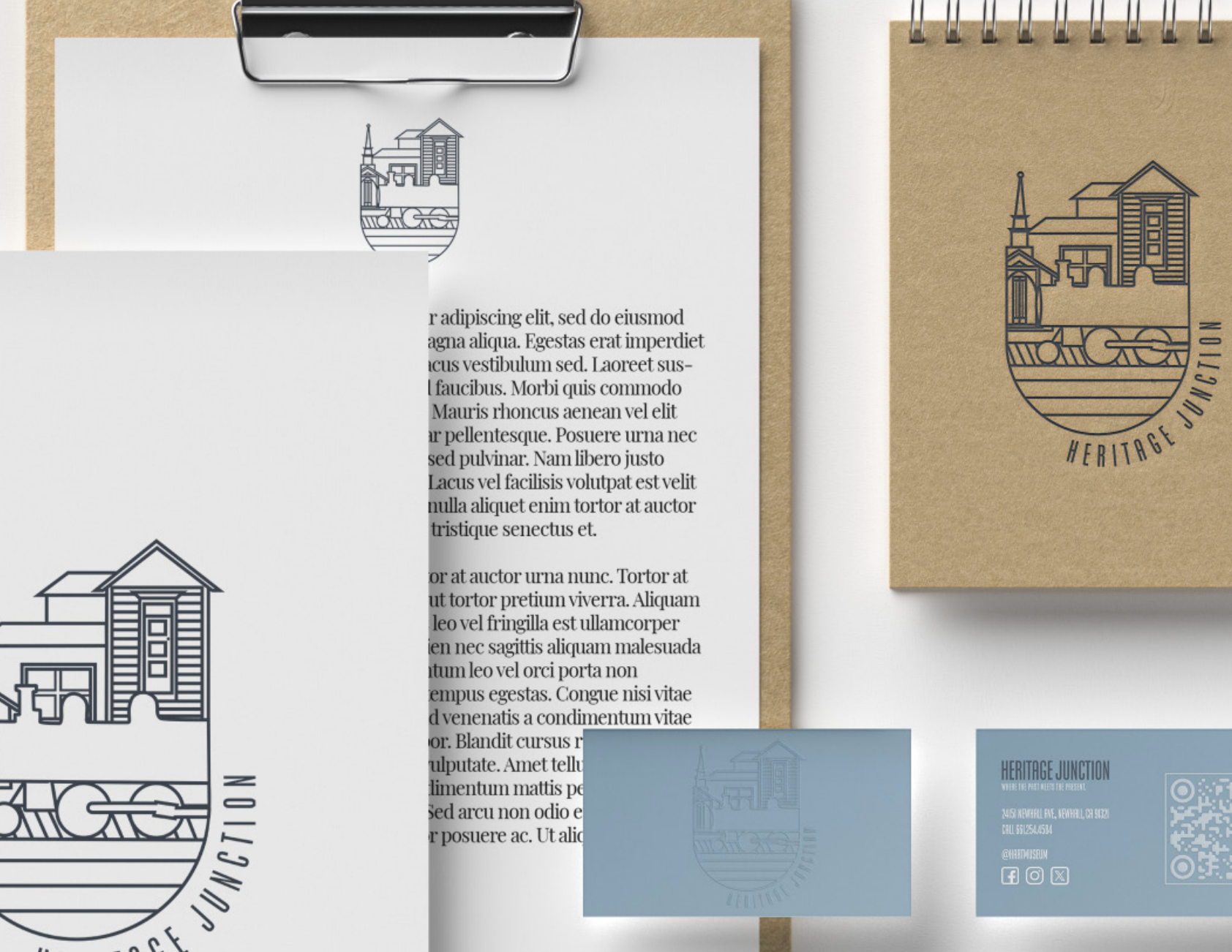
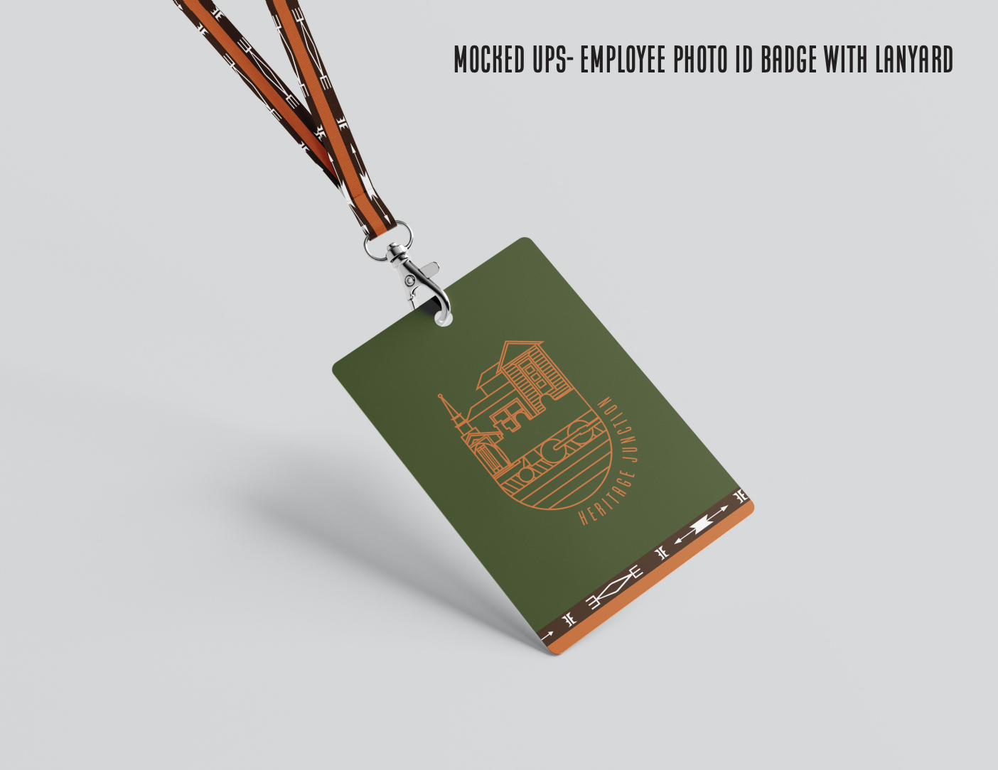
After finalizing our patterns, our team was assigned to create mockups for key branding materials, including an Employee Photo ID Badge with Lanyard, Business Card, and Coffee Mug.
For the mug design, I focused on incorporating our custom patterns alongside the primary logo to ensure that the final product was both visually striking and uniquely representative of Heritage Junction. This approach helped reinforce the brand identity while adding a distinctive and memorable touch to the merchandise.
This phase of the project highlights my ability to apply brand assets effectively in real-world applications, ensuring a cohesive and engaging visual identity.
Brand Guidelines
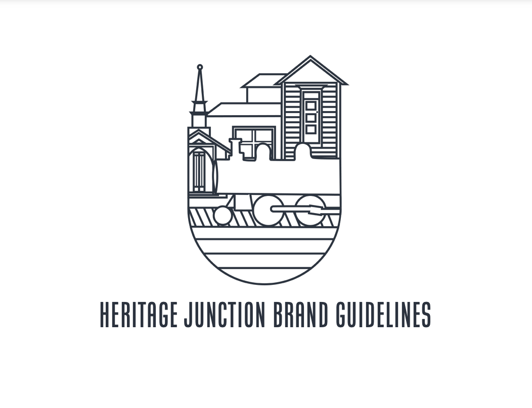
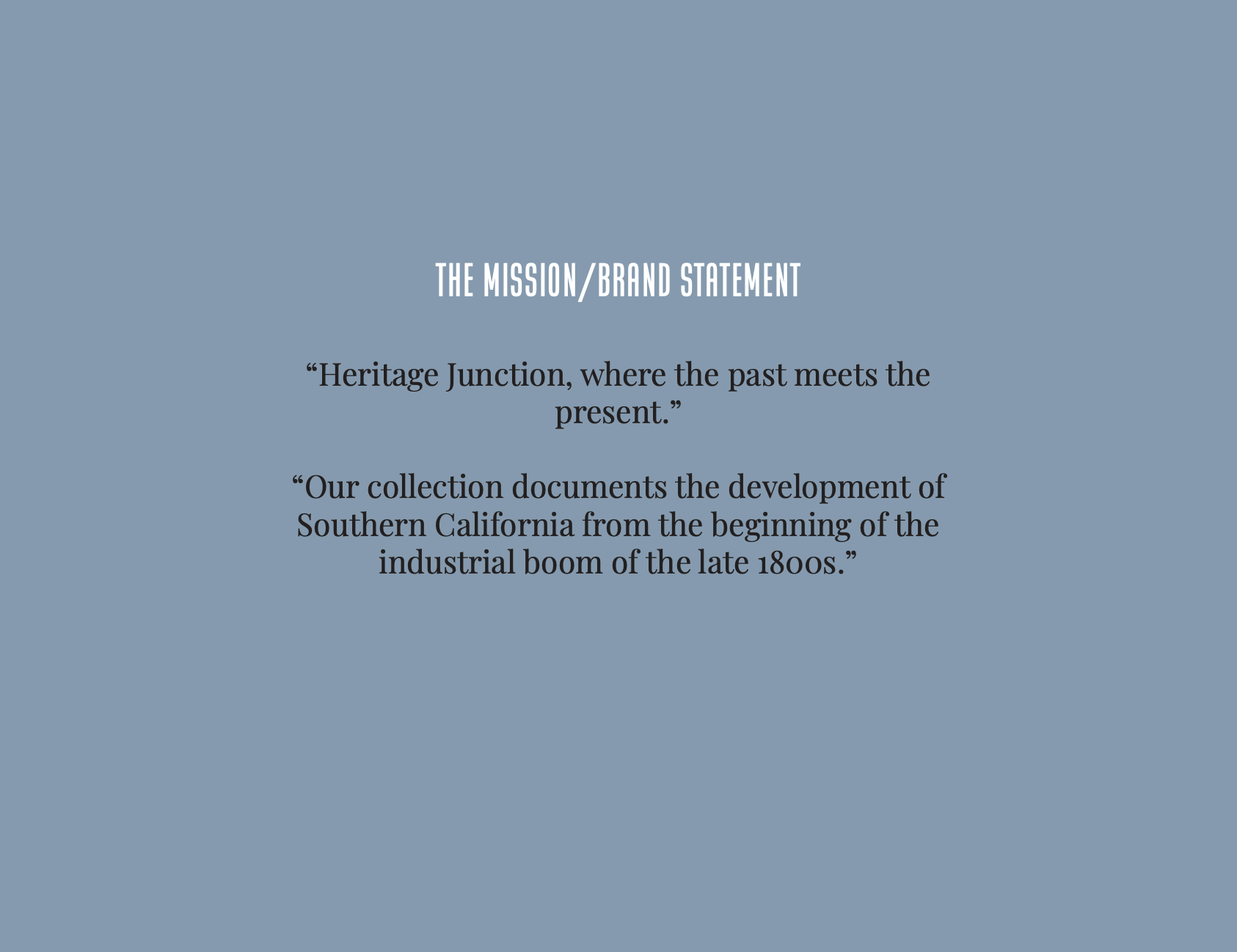
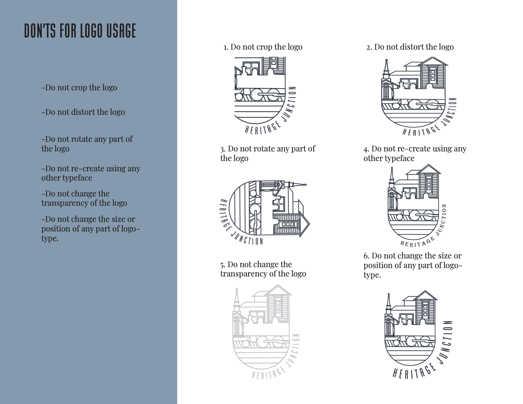
This is my groups brand guidelines presentation and goes into depth of how the Heritage Junction Branding should be followed by the primary logotypes, the color palette, typography, and patterns.
Overview
Working on a branding project as part of a group was an incredibly enriching experience. Collaborating with a team brought together a variety of perspectives and skills that significantly enhanced the creative process. We began by brainstorming and sharing initial ideas, which allowed us to tap into a wide range of creative insights and conceptual approaches. Each member contributed their unique strengths—some excelled in illustration, others in typography or digital tools—creating a well-rounded and cohesive final product. Regular zoom meetings and open communication via WhatsApp were crucial; they not only kept us on track but also fostered a sense of camaraderie and mutual respect. Constructive feedback sessions enabled us to refine our designs, ensuring that the final brand identity was polished and professional. This collaborative effort not only resulted in a successful project but also provided valuable lessons in teamwork, effective communication, and the synthesis of different artistic visions into a unified brand narrative.

